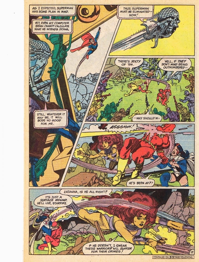
In an attempt to make superman relevant to the early 80's comic reader, Marv Wolfman redesigned Brainiac to look like a robotic skeleton with a robotic ship of living metal. The great Gil Kane was brought on to help with sales. Marvel may have been more popular at the time but you have to give it to DC for doing their best to make great books.
Gil Kane is shown here in all of his glory. Just check out this stunning cover that he created. though his work is not the most highly detailed or flashy work, he is one of the best designers out there.
Just look at all of dynamic tension here with the plum of smoke slashing down the page from the upper right corner to the lower left, with heroes studding either side. And though he took liberties with Superman's cape, making it look more like a pair of wings than a cape, it creates a very dynamic feel countering the smoke and flames in the background.
When asked why he often posed his figures in a certain way, he replied, "because I worked hard to learn how to do it and I want to use it." You can see that about his figures. He knows anatomy as good or better than anyone. Kane is one of those guys that loves form and his figures are just shapes to mold into intriguing compositions. For Kane slick shading comes second to creating dynamic compositions with his shapes. You even see it in the panel shapes, preferring slashing angular panels to static grid panels.
Gil Kane is always a joy and inspiration. He's one of those artists that makes me want to get the paper and pencil out and try my hand at comics.
Brainiac is a great addition to our tribute to robots. he is an evil AI with lots of cool robot style.


No comments:
Post a Comment